Food Recovery
Food Recovery is a nonprofit that bridges the gap between organizations with surplus food and communities in need
Annually, 133 billion pouds of food is wasted. In 2023, 13.5% of U.S. households experienced food insecurity at some point.
Food Recovery promotes sustainability by redirecting edible food from landfills. Their current impact has been collaborating with 3,400+ food partners nationwide, rescuing and donating 52+ million pounds of food, and extending their impact across all 50 states.
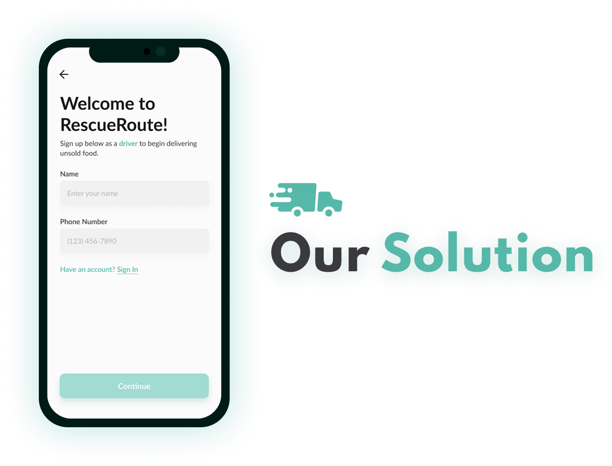
Truck drivers willing to donate need an easier way to be connected to organizations accepting donations through a centralized and user-friendly platform.

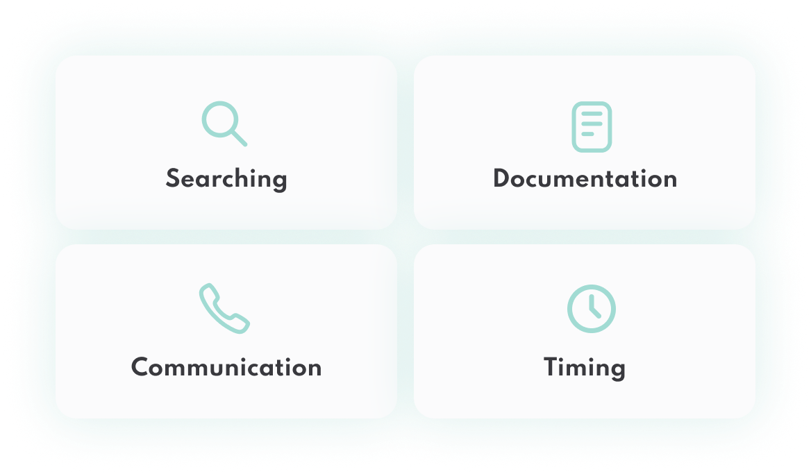
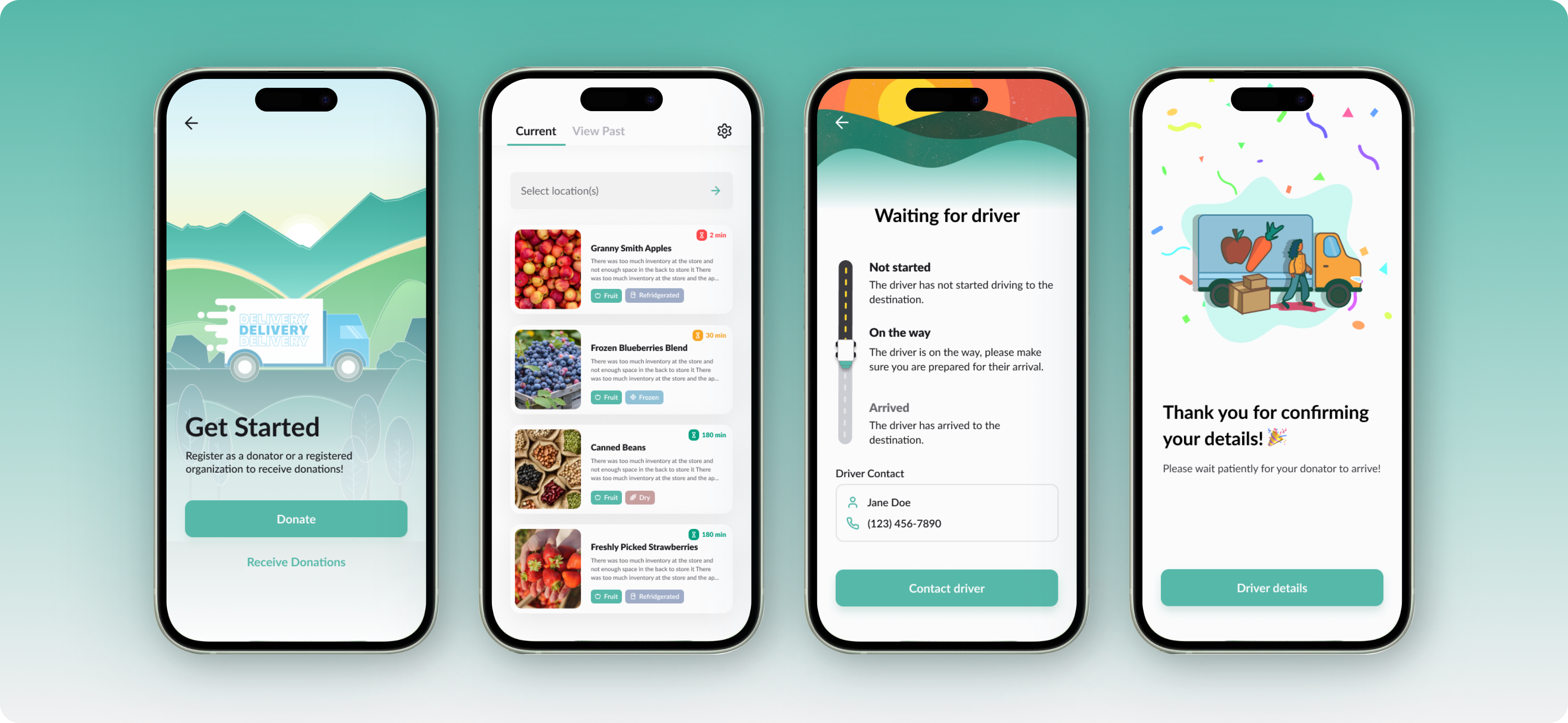
ResueRoute connects donating truck drivers with organizations leaving us to manage documentation, communication, and timing independently.
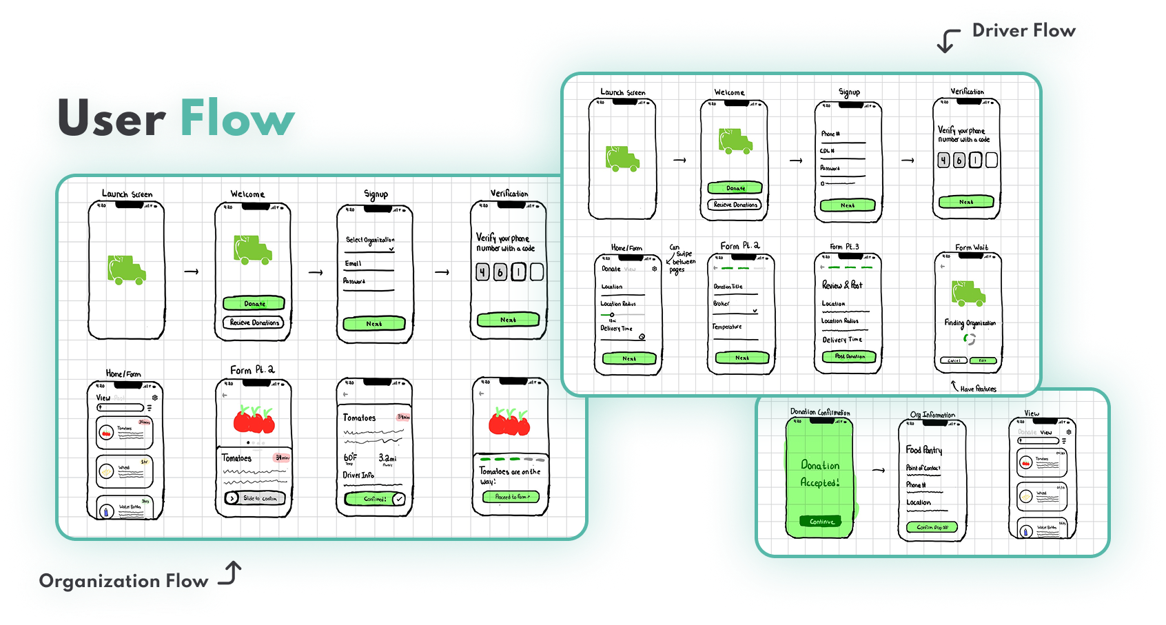
Getting started involved understanding the different user bases, brainstorming ideas, creating sketches and finally being able to set up our design system to get started with creating our first iteration.
We first conceptualized what we wanted the app to look like and sketched out initial mockups for the user flows. Then we decided the best way was to split it up into two different flows--one for the truck drivers and one for the recipient organizations
We had to figure out a way to make the app align with the previous platform food recovery but also allow it to be its own entity, this involved thinking of a new name, using different colors but still ones that work with the site and creating a new logo

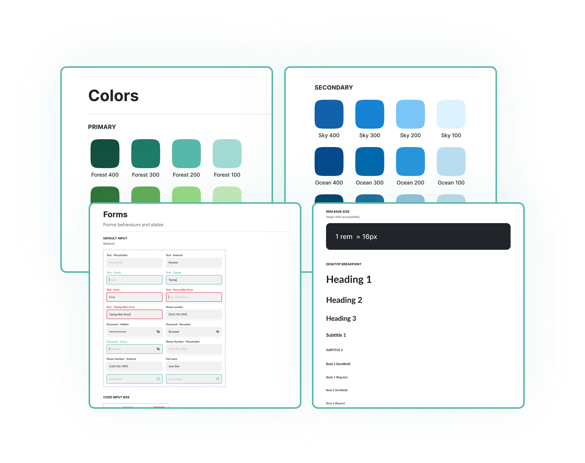
As new designers, we were initially unfamiliar with Figma features such as variables and auto layout, but through the project we quickly learned and applied them to improve our workflow and designs.

How do we optimize the user experience?
We focused on designing card components that felt clean and uncluttered, introduced scroll functionality for ease of use, filled empty spaces with custom graphics, and prioritized directional convenience to ensure both drivers and organizations could access what they needed as seamlessly as possible.


One thing I learned was how to work with another designer.
I was on this project paired with another designer. We were both tasked to complete different pages and sometimes there would be disagreements due to a difference of opinion. I learned how to advocate for what I believed in but also to be open to new perspectives.