Top Tier Lessons
Top Tier Lessons is an educational startup that connects college student-athletes with local families to provide personalized sports lessons and mentorship.
By leveraging the skills and experiences of student-athletes, the platform creates a mutually beneficial system where kids receive high-quality coaching while athletes gain flexible income and community engagement opportunities. The company focuses on accessibility, convenience, and fostering positive relationships between young learners and role models.
The current landing page lacks clear, industry-standard informational content such as detailed service descriptions, value propositions, and trust-building elements (e.g., testimonials, pricing transparency, and instructor credentials). As a result, users may struggle to fully understand the offering or feel confident in making a purchase decision. In addition, the existing checkout flow is limited to single-lesson transactions, preventing customers from seamlessly purchasing multiple lessons in one session. This gap not only creates unnecessary friction in the user journey but also restricts opportunities for increased sales and long-term customer engagement.
- Enhance the landing page with clear, industry-standard informational content that communicates value to users.
- Improve clarity of offerings by highlighting lesson types, benefits, and pricing upfront.
- Redesign the checkout flow to accommodate multi-lesson purchases in a seamless way.
- Reduce user friction by simplifying steps and minimizing repetitive inputs during checkout.
- Increase user trust and confidence through transparent information, visuals, and streamlined navigation.
- Align the overall experience with best practices in modern e-learning and e-commerce platforms.
Top Tier Lessons utilized screen monitoring data to uncover pain points.
- Users seeking additional information often got stuck navigating in circles without finding what they needed.
- Newer coaches received less visibility and engagement compared to established ones.
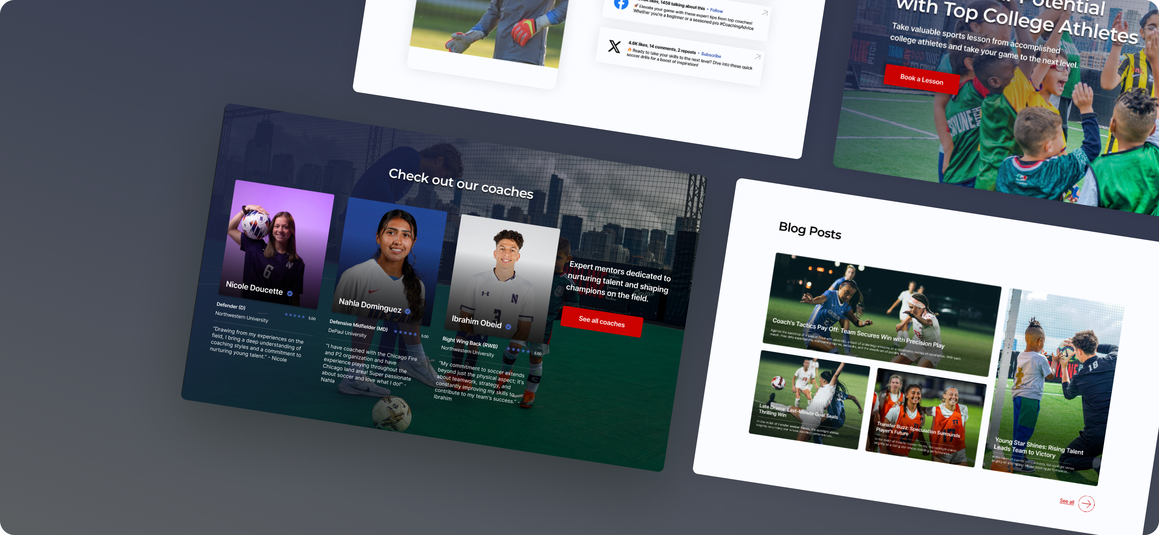
- The site lacked a dedicated page to showcase and preview blog content.
- Social media links were buried in the footer, making them hard to notice and engage with.
- The overall design appeared somewhat outdated and not aligned with modern standards.
- There were no coach pages tailored to specific sports, limiting relevance for users.
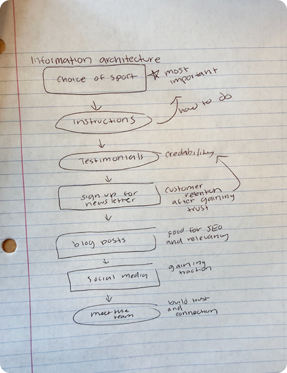
Getting started involved understanding the different user bases, brainstorming ideas, creating sketches and finally being able to set up our design system to get started with creating our first iteration.
We first conceptualized what we wanted the app to look like and sketched out initial mockups for the user flows. Then we decided the best way was to split it up into two different flows--one for the truck drivers and one for the recipient organizations
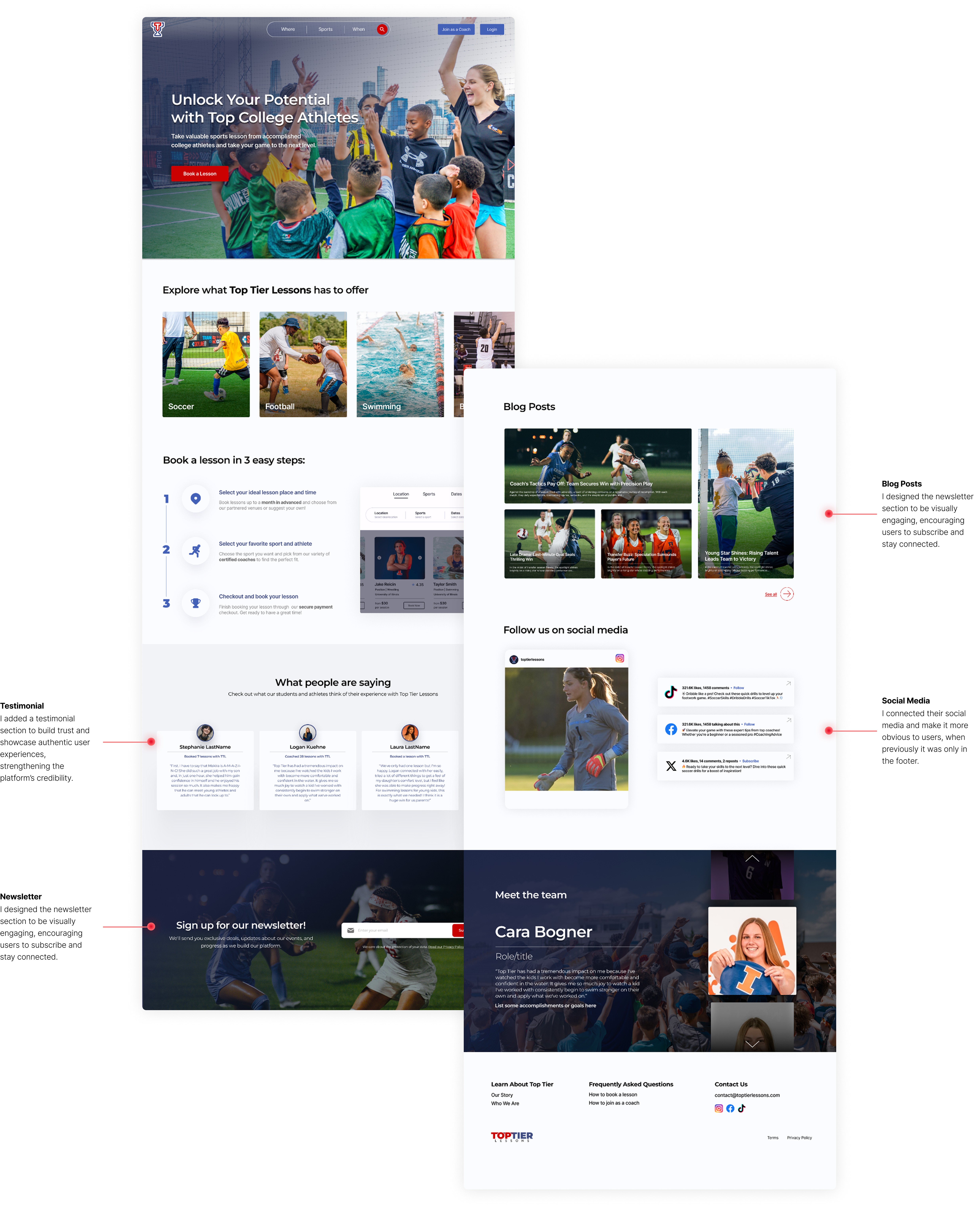
We want to guide users through the booking process, build credibility and trust, incorporate SEO-optimized content, and highlight social media channels to increase visibility and engagement.
- Adding hover states that provide detailed explanations without overly increasing cognitive load at initial glance at landing page
- Connecting their blog site to landing page for people to access right away with previews of relevant articles
- Dedicated interactive section for social media.

- I keep similarities between landing page and sport specific pages as per requested by client but offer opportunities to showcase specific coaches to help increase their traction
- Also we add categories such as Elementary, Middle and High School for more information on age ranges

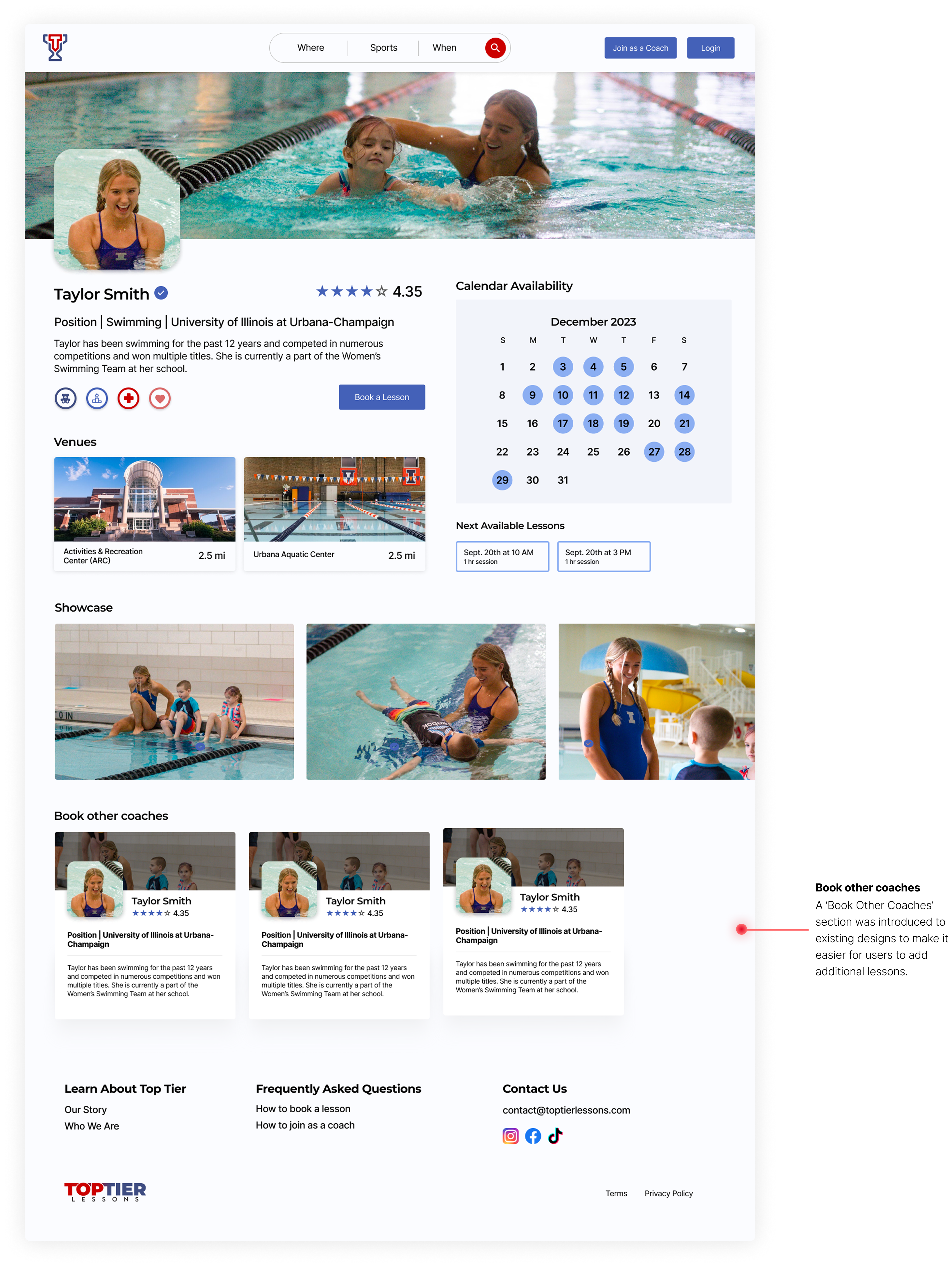
I redesigned the calendar selection flow to support recurring lessons and multi-lesson checkout, drawing on competitor research to align with user expectations and industry best practices.

Only incremental adjustments were made to preserve familiarity for users, while introducing advanced features—such as adding multiple lessons—to improve ease of use.

I learned how to gather insights and uncover painpoints from data such as screen monitoring and interview reports.
Starting this project was a little intimidating because I was given a task with no specific requirment as first. I had to find pain points on my own and try to adjust my designs accordingly. With a vauge task like that I was worried that I was looking at the wrong information or focusd on the wrong thing, but as I progressed I learned how to seperate the big issues from the little ones.